-Summarise the style/period.
During the early to mid-1900s in Europe (most specifically Switzerland), a specific style for design appeared that had a huge emphasis on cleanliness, readability, and objectivity. This type of style became Swiss Design or the International Typographic Style. Helvetica was created to showcase the principles of this movement Helvetica does pretty much mean Swiss in Latin after all.
-What colours,themes etc. typify this period?
Among the biggest jumps in the design world that Swiss Design managed to add is, for sure, its big use of sans serif typefaces. This is jump is the kind that is relevant to this day. Look around and you’ll most definitely see a sans serif within a rather short distance of you. It’s not that Swiss Design is the sole reason sans serifs are being used today, but it played a major role in making it’s use more welcome, and making it a standard for readability and cleanliness. Most used typefaces in the Swiss-style are (neo) grotesque sans serifs like Akzidenz Grotesk, Helvetica, and Univers. Reasoning for this is that typefaces almost always end up being rather neutral.
-Who are the main practitioners of the period?
Max Bill,Emil Ruder,Armin Hofman,Josef Muller-Brockmann,Josef Muller-Brockmann,Max Huber,Wolfgard Weingart.
-What would you like clarification on ?
What ended up distinguishing Swiss Design in practice was the use of asymmetric layouts with aligned text flush-left, ragged-right (sans serif typefaces like Akzidenz Grotesk and, later, Helvetica) and, most importantly, the use of a mathematically placed grid that determines how the design elements are placed, that remains very important to this very day, especially in web design. In the end, we wouldn’t even think of them as Swiss to begin with. In order to understand how different they were back then, let’s look of two different American advertisements from the period one before Swiss Design, and the other one after Swiss Design.
-Think of the social,political and cultural contex -what forces shaped the design/art
Swiss Design was, essentially, a development that was effective during the ’50s. According to what we know about them, there were two art schools back then that followed it, one being the “Kunstgewerbeschule” in Zurich, owned by Josef Müller-Brockmann (1914-1996), and the other one being “Allgemeine Gewerbeschule” in Basel, owned by Armin Hofmann (1920-present). Both of them studied under Ernst Keller in Zurich, before World War II started. Back then, they had a style which was called the International Typographic Style, and it was was guided by the essence that design should be as less visible as possible. All traces of the designer’s subjectivity should be suppressed in order to let the content of a work shine through. In fact, it’s rather similar to the axiom/rule of architectural modernism, that says that function should always be followed by form.
-Any additional observations?
In the world of graphic design, the Swiss Design is a very influential developing movement throughout the world. Sometimes, it can be easy for people to think that the way they do things nowadays have always been a norm, but I’d argue that it’s very important to see where these same norms come from. I also think that having the ability to identify certain styles of design is rather important. Furthermore, if one is able to identify styles with ease, as well as other design movements of course, then realising their similarities and differences can help you figure out how things truly work.
-Does the work remind you of any contemporary designers or design?
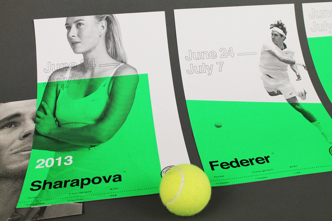
The Championships by Abbas Mushtaq
A reassessment of the Wimbledon Championships, of sorts. Through the process of global cooperation, they use the process of applying old International Swiss Style design objectives in a current global circumstances.

Design Days (2014)
The Design Days poster appears as a minimalist essence, referencing the modernist style of the last century. Evoking the name of the event, both D are intertwined, thus claiming that design, in it’s purest form, has little to no boundaries.
Strong visual codes plain colours, gradient, and geometric shapes recall the event topic itself, design. Official Colour of the Design Days, both silver and yellow fulfil each other, but, in the end, they are both completed with a tonic blue. A direct contrast has been made to the decently refined style that the poster has, by the serif typography made back in 2012. However, the whole picture blends in completely, as it is contemporary.
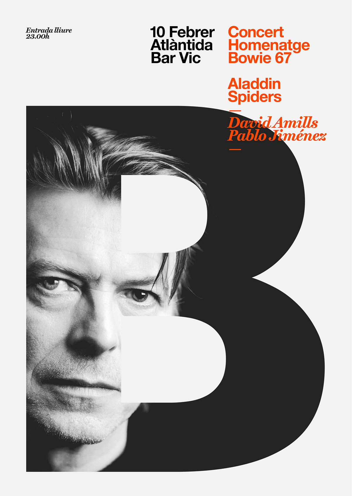
David Bowie by Quim Marin
In what he describes as a visually polluted environment, Quim Marin a Barcelona-based designer and art director tries to conceive concepts and create designs that are fresh and memorable, with a clear aim at essential beauty and equilibrium.
*https://99designs.ie/blog/design-history-movements/swiss-design/
